Celtra Interscroller
Context
Company: Celtra
Timeframe: 2014 - 2015
Role: Director of Product
Banners are the most ubiquitous form of digital advertising, yet they remained the same awkward rectangles transplanted from printed pages for nearly two decades. Since the first one appeared on HotWired in 1994, the initial 44% click-through rate had dropped to an average of 0.05% by 2014, irrespective of its format.
Mission
With leading media conglomerates, publishers, and ad networks on its client list, Celtra saw an opportunity for innovation. We set out to increase the value of ad inventory for publishers and yield better performance for advertisers by improving user experience of ad formats.
Contributions
I was assigned to lead a research and development project. Key individual contributions:
- Designed and commissioned an eye-tracking experiment that A/B/n-tested people’s responses to the visual intensity of ads.
- Produced 10 concept designs for new ad formats and conducted pilot campaigns to validate 3 prototypes.
- Fine-tuned the final design of the winning Interscroller format to comply with technical and commercial requirements.
- Promoted its rollout by writing thought leadership articles explaining the design rationale.
Results
- Adopted by 400+ premium global publishers, including Vice, Bloomberg, The Guardian, Conde Nast, et al.
- Lifted all standard KPIs, including 35% of all participants expressing positive feelings in an IAB study in partnership with Millward Brown Digital.
- Followed by knock-offs from Google et al.
Highlights
We are all banner blind, or are we?
If people truly hate ads so much, why do Super Bowl and Hall of Fame ads have millions of views on YouTube? When an ad is viewed on demand, it stops being an ad and becomes content. What kind of alchemy does it take to achieve that?
Films and TV shows perfected the art of showing you paid-for branded products by making them a normal part of the story. But it’s the printed magazines that mastered the alchemy of transcending obvious ads. How? By matchmaking content of each issue with relevant brands, with high production quality, and clever visual communication. The glossy full-page spreads with striking imagery we like to flip through in waiting rooms and airport lounges.
These insights led to the following strategic hypothesis:
- People don’t hate ads; they hate noise and gimmicks.
- Banner blindness is a consequence of intrusiveness — ads would get noticed if they were less annoying.
- Attention is transactional — to get value, ads first need to provide it.
Out of sight, out of mind
How do you measure annoyance, especially over the wire? We were skeptical of probes, self-reporting, and interview methods. Getting reliable, unbiased data required a quantitative instrument and sampling data as close to human perception as possible: eye-tracking.
I designed a multivariant test for measuring users’ reaction to one of the four ad experiences of varying visual intensity of ads.
- Static photo
- Cinemagraph photo
- Sequence of photos
- Video footage
All ads promoted the same dummy brand to minimize the subject's (dis)interest bias. Each person participated in one recording session using one device type and was exposed to one predetermined ad type. The study involved 144 participants from a general audience and was carried out in a tightly controlled user-device-media lab environment.
Results couldn’t be clearer. Ads are definitely seen. Especially on smartphones, where they take almost a third of the screen’s real estate, making them virtually impossible to overlook. On mobile devices, the audience’s gaze was sustained the longest by the cinemagraph type, and on the laptop, it was the image sequence.
What seems to work best is the golden middle: motion in moderation.
Ad UX principles
The eye-tracking study steered the direction of our synthesis and distilled the learnings into the following principles:
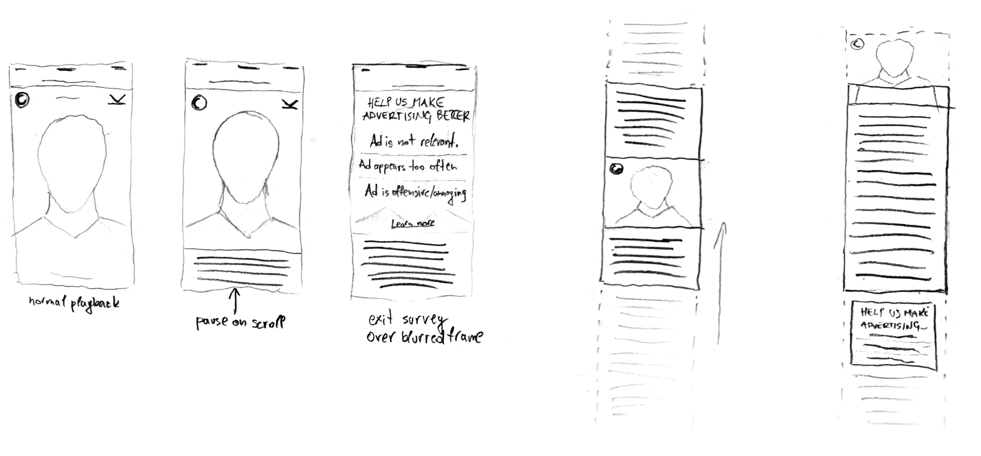
- Intrusion begets defense and termination. Never limit the user’s control of the interaction, block, cover, or otherwise impose yourself.
- Instantly provide value or end up being ignored. Nobody likes to be suckered into things or have their time and effort wasted.
- If you’re a pleasure to deal with, your shortcomings are easier to forgive. Ads are not exempt from user expectations of low latency, gesture-based interaction, and smooth UI transitions.
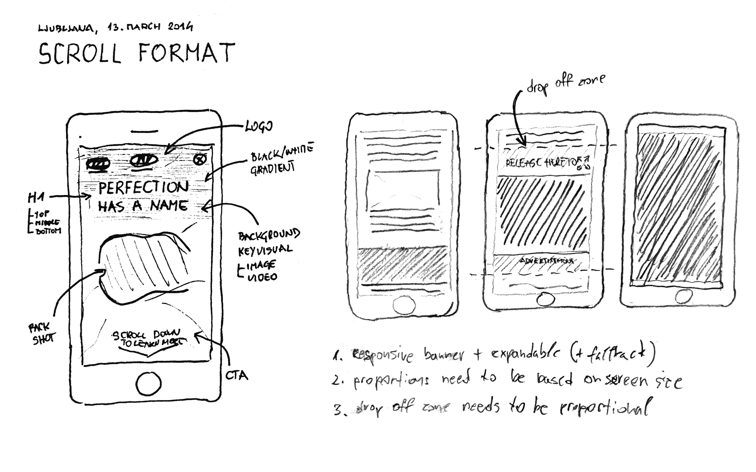
A great ad format would have to look and feel like a natural extension of the publisher’s app or site and offer a big canvas to allow advertisers to show and say something meaningful.
Ideation
I explored possibilities of:
- Frictionless opt-in ad experience interaction
- Novel ad placements within common app and website UI patterns (news, games, utility, etc.)
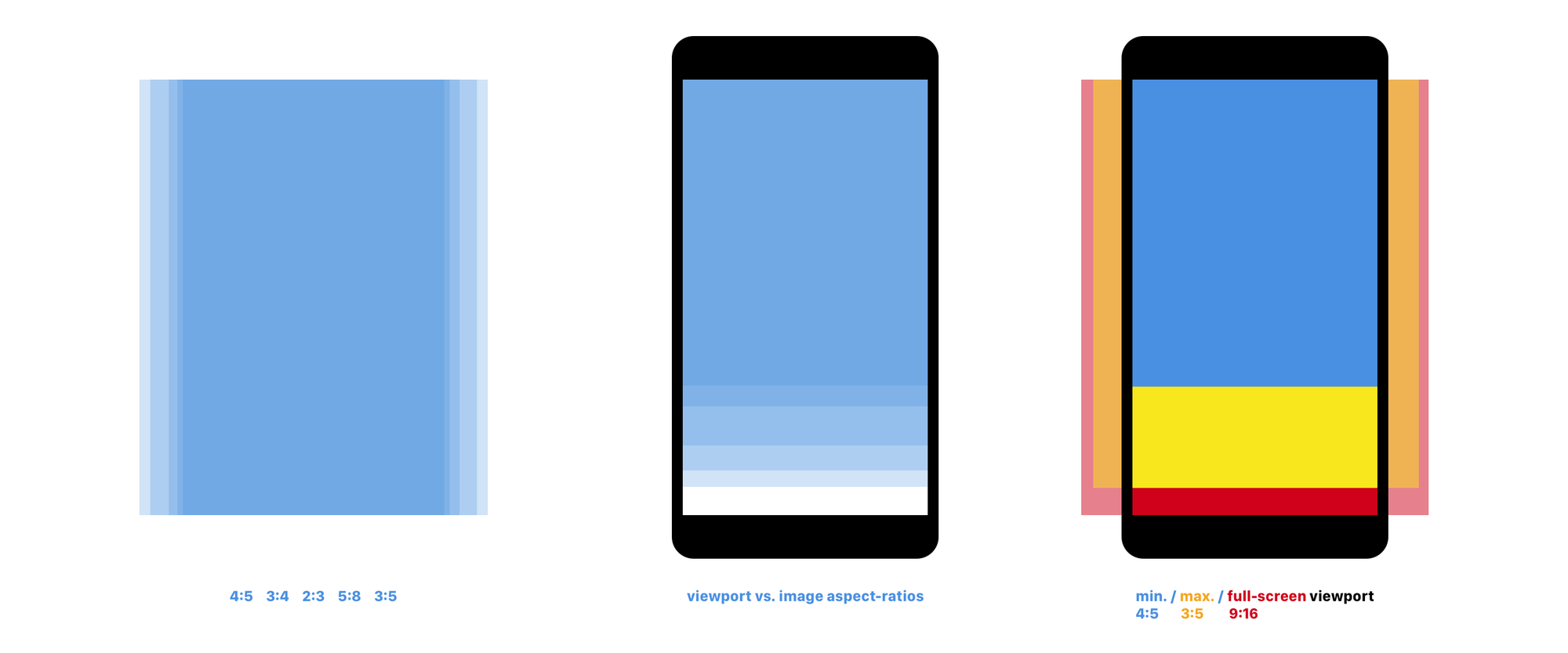
- Standard device screen, viewport, and image aspect ratios concerning responsive behavior constraints
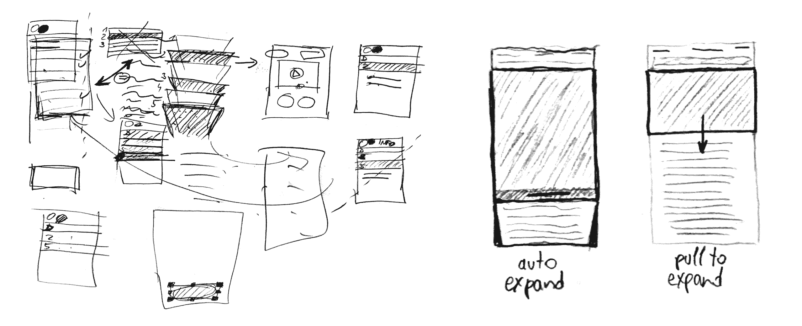
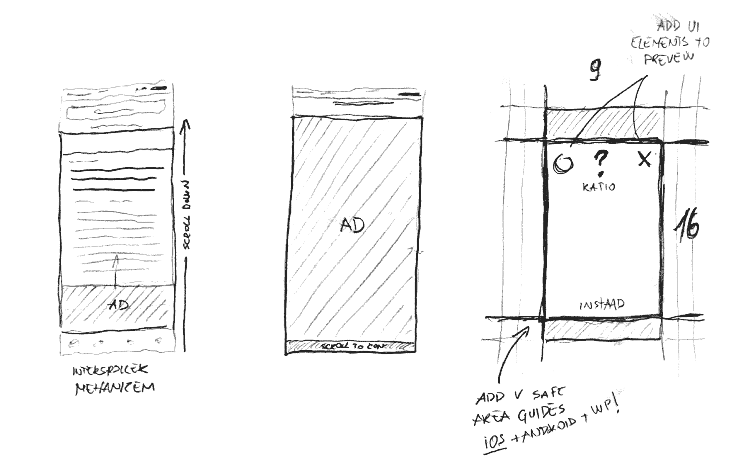
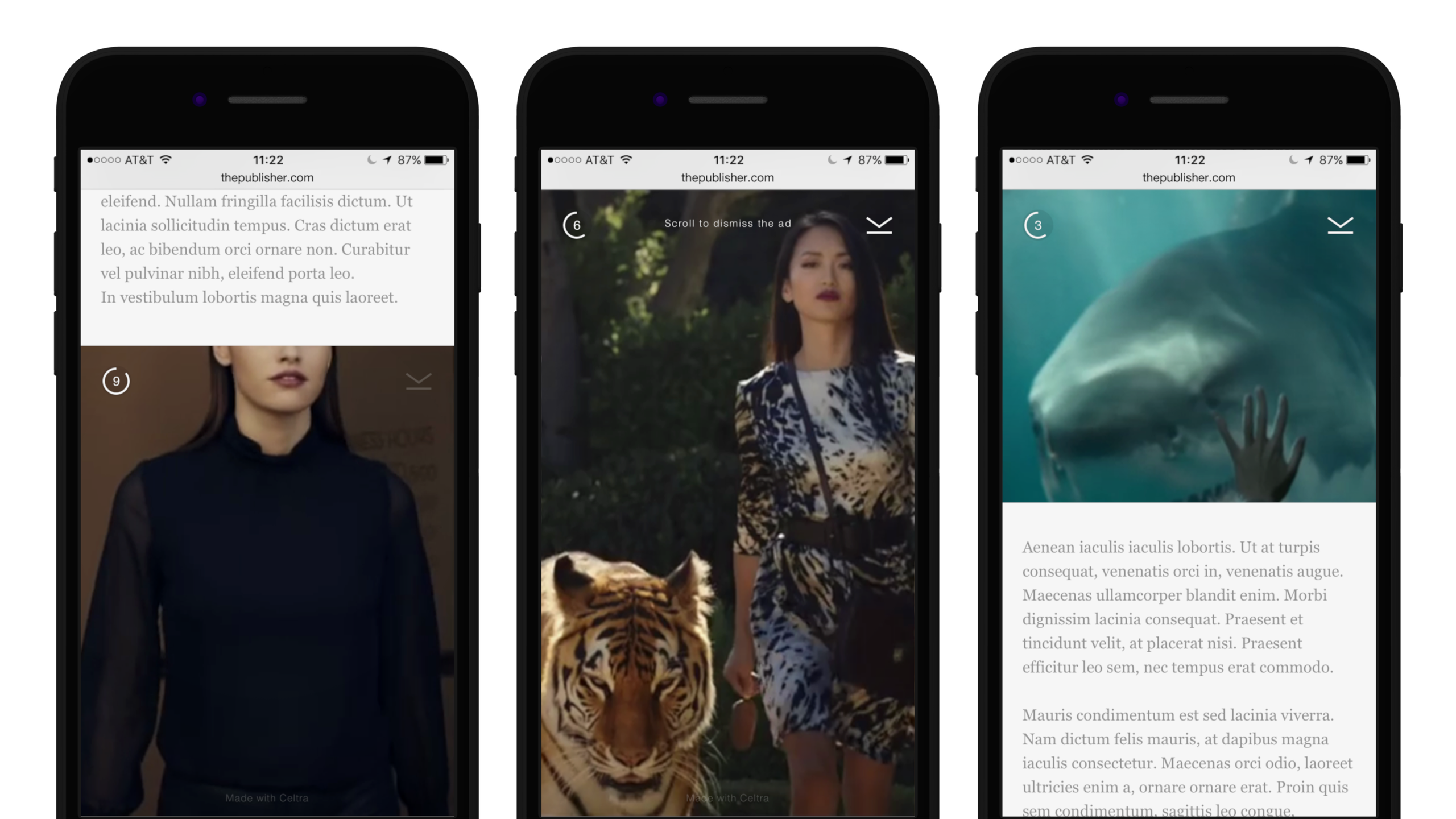
Out of ten produced concepts, a few were developed into prototypes, three of which ran as pilot campaigns, and one that became a GA product: the Interscroller.
Launch and reception
Interscroller debuted on Telegraph.co.uk in October 2014 and was launched in November the same year in partnership with Opera Mediaworks, AdTheorent®, and Allrecipes.
To support the product launch and explain its design rationale, I wrote It’s Time to Shape the Next Generation of Mobile Display Ads.
“Celtra’s Interscroller ad format helps us deliver an impactful combination of storytelling and branding features, along with a superior user experience.”
— Yolandi Oosthuizen, Director of Creative Services, AdTheorent
“The Interscroller unit is a key component within a powerful trend where mobile ads are continuously adapting to fit native mobile interfaces and experiences to ultimately become more beautiful and memorable.”
— Scott Swanson, President, Global Advertising Sales, Opera Mediaworks
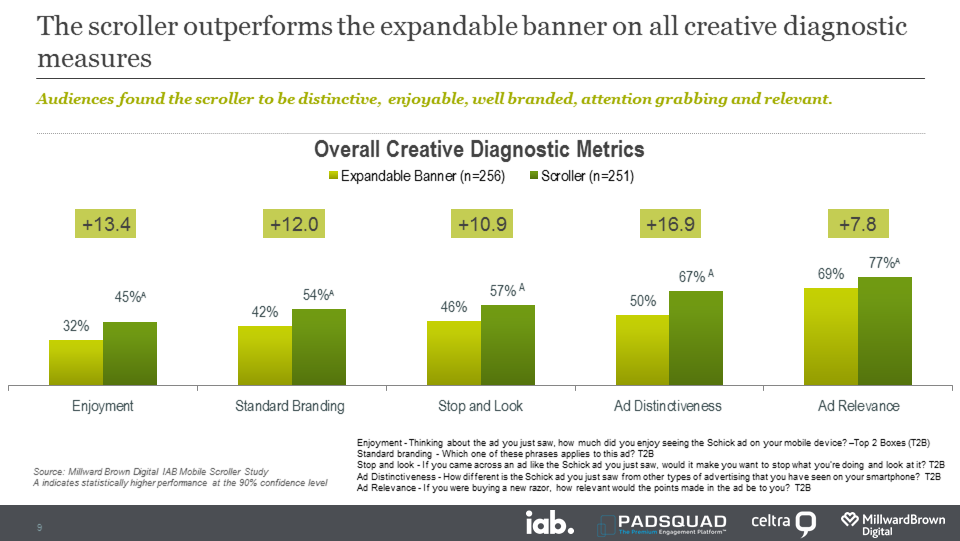
A month later, the IAB published an independent consumer research report in partnership with Millward Brown Digital stating that:
“It boosted awareness, ad recall, and purchase intent, outperforming the standard expandable banner in nearly every category. Equally importantly, it was a hit with the audience.”
— Interactive Advertising Bureau (IAB)
“The ad worked well for all ages, but Millennials showed a particularly strong response to the way the scroller revealed itself, with 44% expressing positive feelings about it (as compared to 31% of those over 35 years old).”
The aftermath
In 2015 and 2016, several competing adtech vendors began offering scrolling ad formats. Unsurprisingly, their takes were less concerned with good user experience. Instead, they exploited the scrolling behavior to the consumer’s detriment, adding their share of dirt to a rapidly growing pile of fraud scandals, malvertising cyberattacks, erosion of user privacy, and other malicious practices that triggered the ad-blocking avalanche.
“Google is bringing new ad types to AMP, including those annoying flying carpet ads.” — Tech Crunch
Consequently, in 2017, industry incumbents formed The Coalition for Better Ads, and Google announced, “They plan to have Chrome stop showing ads […] on websites that are not compliant with the Better Ads Standards starting in early 2018.” The so-called Full-screen Scrollover Ad was on the list of ad experiences that fall beneath a threshold of consumer acceptability.
As a response to market frenzy, I wrote an article about Why User Experience Keeps Getting Scrolled Over By Ad Tech. Soon after, we received a confirmation that Interscroller does not fall into that category.
By 2018, the Interscroller regularly ran on more than 400 global websites and apps, including Vice, Bloomberg, The New Yorker, The Guardian, The Atlantic, Conde Nast, Mail Online, and other media giants. It’s not uncommon to see it to this day.
Credits
Engineering: J. Jančar, K. Slavič, G. Kozak
Product management: G. Lamden, T. Štrok
Data analysis: N. Smith, L. Karelis